OPINION
7 minutes
January 26, 2026
Here is the clean, formatted version of your blog post. You can copy and paste the content below directly into your Webflow Rich Text field. The formatting (headings, bolding, links, and images) has been preserved.
Design trends are a reflection of the social movements that shape our culture.
Design trends are a reflection of the technological innovations and social movements that shape our culture as well as the current needs and preferences of users around the world.
It’s absolutely not mandatory (or even feasible) for businesses to jump at every new trend that comes along. But as designers, it is our responsibility to understand what appeals and speaks to our target audiences in order to create experiences that are useful, accessible, and ethical.
in summary
The world of creatives is constantly changing and a consequence of this is that design elements come and go out of fashion all the time. Having to change things can be annoying from a business perspective but it's imperative from the user point of view because it keeps things interesting.
And to that extent, 2023 has been a very exciting year, indeed. We've seen trends pushing the bounds of effective design while others falling as quickly as they rose to the top.
In this brief article, we're taking a quick look at some of our personal favorites and the ones that made the most noise.
This is perfect for brands that:
This is not-so-perfect for brands that:
Neu-brutalism is a design style that is characterized by its use of bold, geometric shapes, raw materials, and a sense of austerity. It's a reaction to the sleek, minimalist designs of the past few years and combines brutalism from the past with modern-day minimalist standards of typography, illustration, and animation.

Neu-brutalism is a way of challenging the conventional norms of web design and creating a unique and memorable experience for users. It can also convey a sense of authenticity, honesty, and boldness, which can appeal to customers who value these qualities.
However, neu-brutalism is not for everyone, as it can also be seen as harsh, crude, or unprofessional by some audiences. Therefore, it is important to know your target market and their expectations before adopting this style.
This is perfect for brands that:
This is not-so-perfect for brands that:
Typography is more than just choosing a font. It is one of the most essential aspects of design influences how your is message is conveyed and as well as the overall mood.
It's about using type to create a visual effect that is both eye-catching and meaningful. And in 2023, designers have begun taking more risks when it comes typography. Straying away from established design principles and using unorthodox compositions to evoke a certain emotion or convey a message.
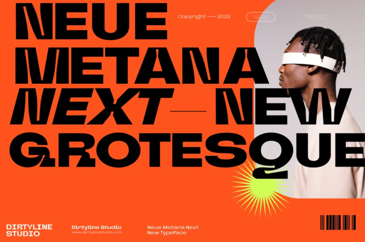
Experimental typography can help you create eye-catching and expressive designs that capture the attention and imagination of users and establish a unique brand identity and personality. For these reasons, we expect the use of experimental typography to grow, with designers using type in new and innovative ways.
That said, experimental typography should not compromise the clarity and legibility of your text. Frustrating potential customers with a typeface that’s “too experimental” is far from ideal. At the end of the day, function should take precedence over form.
This is perfect for brands that:
This is not-so-perfect for brands that:
Microinteractions are small, interactive elements that add personality and engagement to your designs. They can be anything from a simple hover effect to a complex full-page loading animation. Microinteractions are a great way to make your designs more user-friendly and enjoyable.

Microinteractions are quickly becoming mainstream with just how much they add to the user-experience with subtlety and without ever stealing the spotlight. Simple elements such as animated underline to bouncing buttons to more complex animations triggered by user input can provide feedback, guidance, reward, or delight to your users in subtle but meaningful ways. They can also create WOW moments and enhance your branding by showing your attention to detail and personality.
But it’s also important to not overdo it. Microinteractions should not be overused or abused, as they can distract or annoy your users if they are too flashy or frequent. The additional custom code can also add up quickly.
This is perfect for brands that:
This is not-so-perfect for brands that:
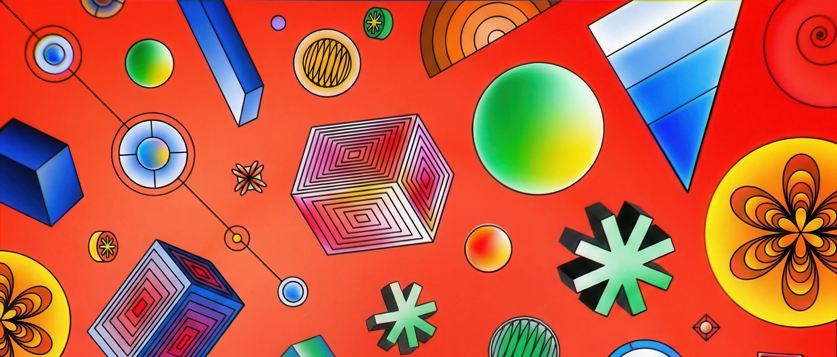
With advancements in technology, 3D and immersive design are becoming more accessible and widely used. This wider adoption becomes evident when you look at how becoming increasingly popular 3D design is becoming.
3D design can be used to create anything from simple icons to complex product visualizations that add an element of realism and professionalism.

But while tools like Octane and After Effects along with open-source libraries with millions of 3D assets have helped tremendously in bringing down design costs, 3D design is still a costly undertaken relative to 2D design. Companies may find it only feasible to use 3D elements in a limited fashion, making it difficult to maintain a cohesive design identity across different mediums.
There are also compatibility and performance issues as well as usability challenges from an accessibility point of view.
This is perfect for brands that:
This is not-so-perfect for brands that:
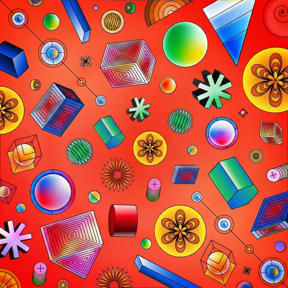
Breaking away from traditional geometric shapes, abstract and organic shapes are being widely used in design to create unique and visually striking compositions. These shapes add a sense of dynamism and playfulness to designs, helping brands stand out and communicate a more creative and artistic message.
Similarly, abstract shapes and gradients are a great way to add visual interest to your designs. They can be used to create a sense of movement, depth, or simply to add a pop of color. Abstract shapes and gradients are a great way to make your designs stand out from the crowd.
Together, these can also help you express your brand identity and message, as well as evoke certain emotions or associations in your users. Designers are using abstract shapes and gradients to create patterns, backgrounds, icons, logos, or illustrations.
This is perfect for brands that:
This is not-so-perfect for brands that:
Neumorphic is a design style blends skeuomorphism and flat design principles, creating a soft and tactile look. It uses subtle shadows, highlights, gradients (often relying on monochromatic colors) to create a sense of depth, while still maintaining a clean and minimalist look.
It creates a really soft and plastic-like look, with layers which is why it’s often referred to as “soft UI”. Neumorphic can add depth, dimension, and a sense of realism to user interfaces, enhancing the overall user experience – making it a great way to add visual interest to your designs without being overwhelming.
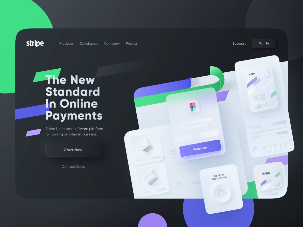
On the downside, neumorphic design can also pose some challenges, such as accessibility issues due to low contrast ratios, difficulty in implementation due to complex code requirements, and incompatibility with certain brands or products that do not prescribe to the neumorphic design philosophy.
Design trends are constantly evolving and influencing the way we create and consume digital products. As a business owner, designer, or aspiring creative, it’s always useful to know about the latest design trends and how they can help you improve your product or service and achieve your goals.
However, you should also be careful not to blindly follow the trends without considering your users’ needs and preferences, as well as your own brand identity and message.
Ultimately, the best design is the one that works for you and your users.
%20Thumbnail.jpg)