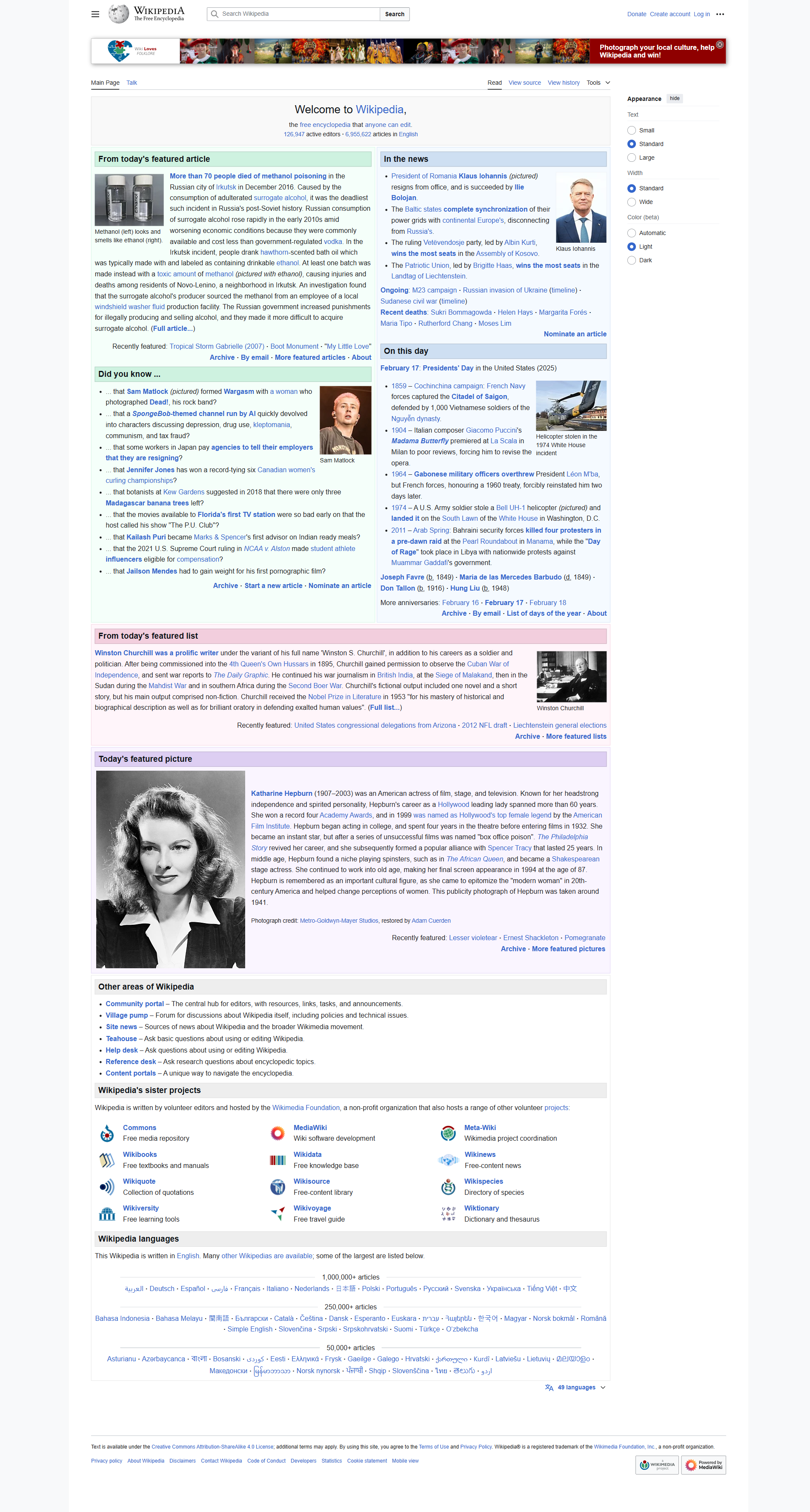
The modern web is largely engineered to prevent the act of sustained reading. Consumer publishing platforms subject readers to layout shifts, autoplaying video containers, sticky newsletter prompts, and algorithmic recommendation loops designed to maximize ad impression velocity. When the Wikimedia Foundation rolled out Vector 2022 – Wikipedia's first comprehensive interface overhaul in more than a decade – it offered an antidote to this extractive trajectory: radical, deliberate restraint.
Design commentary often evaluates redesigns through the lens of aesthetic reinvention: bold color palettes, fluid vector micro-animations, and trendy typographic pairings. By those commercial metrics, Wikipedia’s modern interface updates appear conservative, almost invisible. Yet this subtle execution reflects a sophisticated understanding of civic infrastructure. An encyclopedia serving billions of page views across every conceivable device, network constraint, and language script cannot afford decorative indulgence. Every pixel choice must serve comprehension.
The central dilemma of encyclopedia architecture is navigating density. Wikipedia articles are not five-hundred-word blog posts; they are thirty-thousand-word scholarly syntheses dense with citations, geographic coordinates, infoboxes, and chemical formulae. Enhancing accessibility without compromising the information density required by researchers demanded surgical structural adjustments rather than cosmetic styling.
"Our goal wasn't to reinvent how people read Wikipedia, but to make the world's knowledge more welcoming and accessible to the next generation of readers, while protecting the core utility that makes Wikipedia work."
Wikimedia Foundation Product Team, Announcement on X & Diff Article
01The Typography of Measure and Ocular Fatigue
For over twenty years, legacy Wikipedia stretched body paragraphs across the entire horizontal span of the browser window. On modern ultrawide desktop monitors, lines of text frequently extended over two thousand pixels in width – spanning more than two hundred characters per line. This unbounded measure severely degrades reading comprehension: the human eye must execute long, tiring saccadic jumps across the screen, frequently losing tracking when scanning back to the next paragraph line.
Vector 2022 resolved this reading fatigue by enforcing a strict maximum measure, capping line length to a scientifically validated range of 50 to 75 characters per line. While power users initially protested the resulting margins, empirical eye-tracking and comprehension tests validated the decision. Readers digest complex informational paragraphs with dramatically fewer regression errors and sustained cognitive focus.
"Testing showed that limiting reading width to a maximum measure reduced reader eye strain and increased reading speed by nearly 30% across long-form encyclopedic entries."
Wikimedia Design Research, Vector 2022 Usability Study
Structural Principles: Commercial Web vs. Wikipedia Restraint
- Layout Stability: Commercial sites introduce cumulative layout shifts (CLS) to accommodate dynamic advertising units; Wikipedia enforces zero-shift static document flow.
- Reading Measure: Commercial web defaults to arbitrary responsive full-bleed; Wikipedia locks optimal typographic line length (50–75 characters) regardless of viewport dimensions.
- Navigation Context: Commercial sites obscure article hierarchy behind off-canvas drawers; Wikipedia pins a persistent, active-state table of contents in viewport margins.
- Hydration & Execution: Commercial platforms demand multi-megabyte JavaScript hydration runtimes; Wikipedia delivers pure semantic HTML rendered on the server in single-digit milliseconds.
02Spatial Memory and the Persistent Margin
Long-form digital scholarship requires robust spatial landmarks. In the legacy interface, navigating between sections required readers to repeatedly scroll back to the top of the article to access the static table of contents, destroying reading flow. The revised interface anchors a sticky table of contents permanently in the left margin.
As a user scrolls through thousands of words, the index highlights their active reading coordinates in real time. Readers can jump across historical timelines or scientific methodologies with a single click, without ever losing their visual orientation. By decoupling document navigation from page scroll position, the interface transforms dense textual archives into easily traversable reference trees.
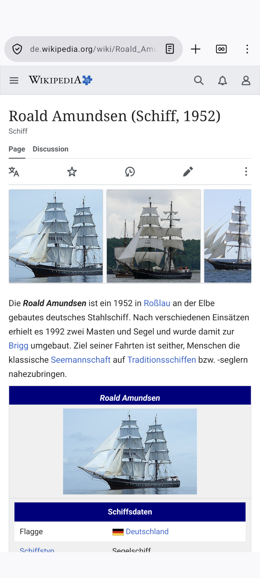
Crucially, the mobile layout executes this navigational discipline without adding visual weight. Collapsible drawer structures keep headings accessible on small viewports without obscuring the reading canvas, ensuring that users on budget mobile hardware retain the same navigational agency as researchers on high-end desktop workstations.
03Performance Budgets as Civic Equity
The most radical aspect of Wikipedia’s interface engineering is its strict adherence to performance budgets. While typical commercial web applications ship several megabytes of client-side JavaScript, third-party trackers, and font variations, Wikipedia remains fundamentally server-rendered HTML and lightweight CSS.
The entire page structure loads and becomes interactive within milliseconds, even over degraded 2G and 3G cellular connections in the Global South. By refusing to adopt client-heavy Single Page Application frameworks, the Wikimedia Foundation ensures that access to human knowledge is never gated behind high-end mobile processors or expensive data plans.
In a design landscape increasingly driven by speculative trends and manipulative dark patterns, Wikipedia’s quiet modern evolution stands as a powerful demonstration of design maturity. It proves that the most impactful product design is often the most disciplined: establishing clear information hierarchy, honoring human ergonomics, and having the courage to leave well enough alone.
End of entry